Graphic Design Student at DMJX, Copenhagen, Selected Work 2025

Portfolio

I'm a graphic design student based in Denmark. My work spans brand identity, campaign concepts and print, built primarily in the Adobe suite. I care about work that has a clear idea behind it.

Selected Projects 3 works
01

01 / 03

¥AFF$

Brand Identity

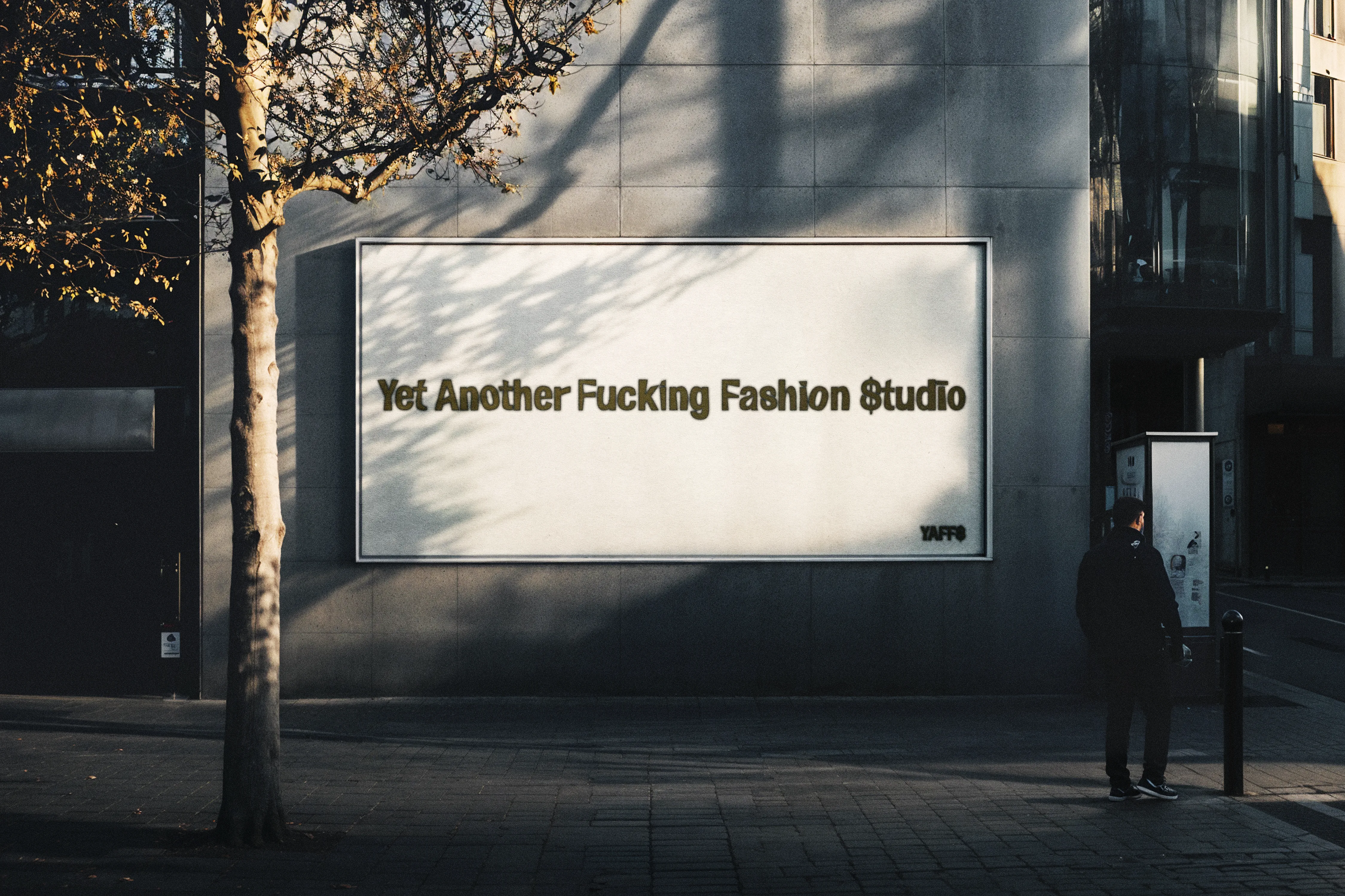
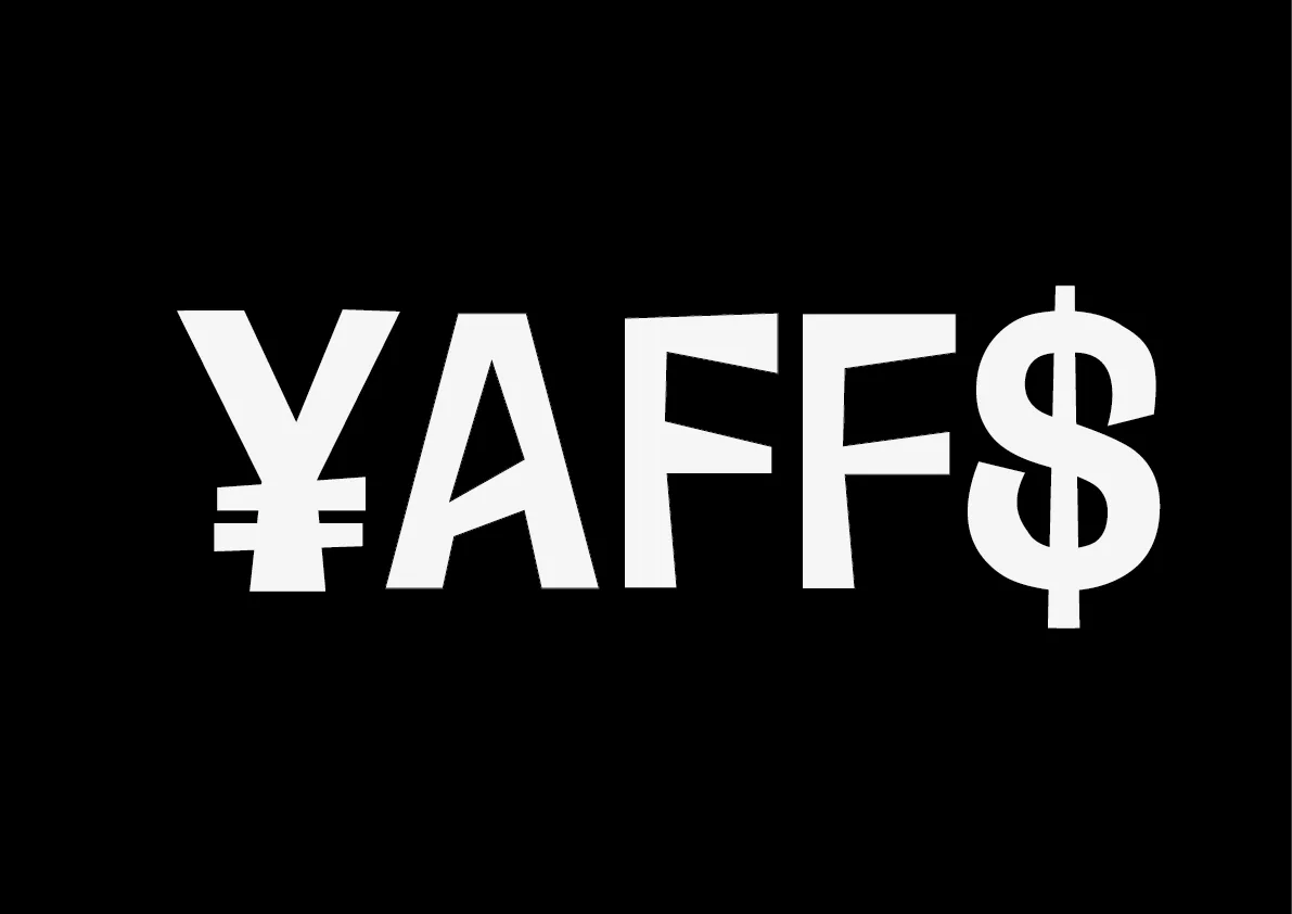
¥AFF$ (Yet Another Fucking Fashion Studio) is a conceptual fashion brand built around a single idea: that fashion is "economical gain dressed as culture." The ¥ and $ replace the Y and S in the logotype, turning the brand's own critique into its mark. Applied across print, stickers and out-of-home.

Brand Identity · Print · OOH
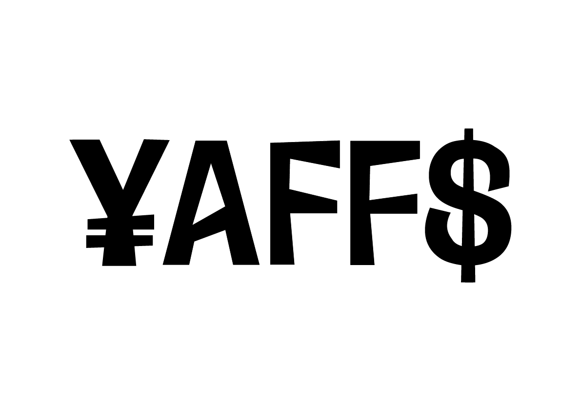
¥AFF$ logotype, black on white
¥AFF$ logotype, white on black
¥AFF$ billboard mockup
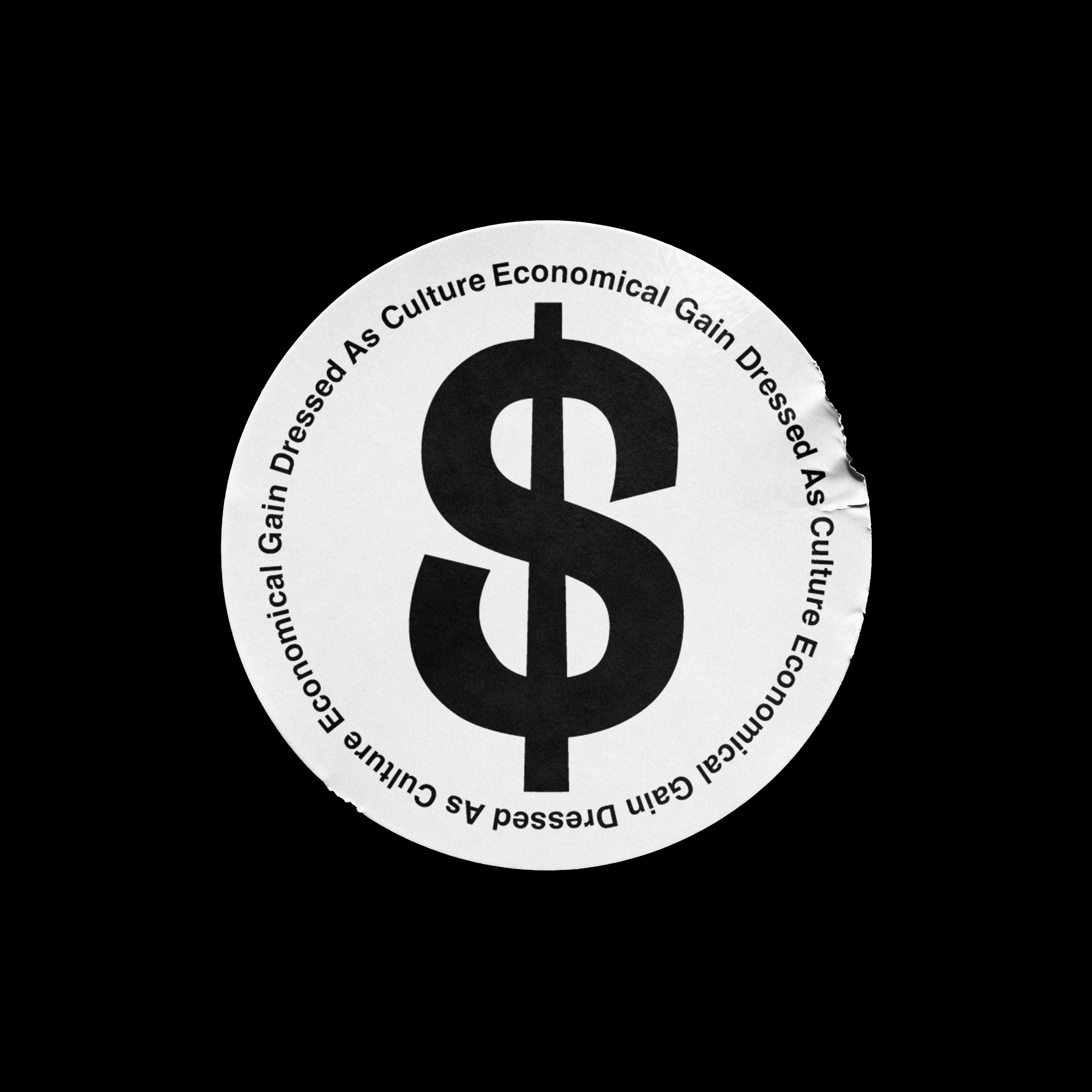
¥AFF$ sticker, black on white
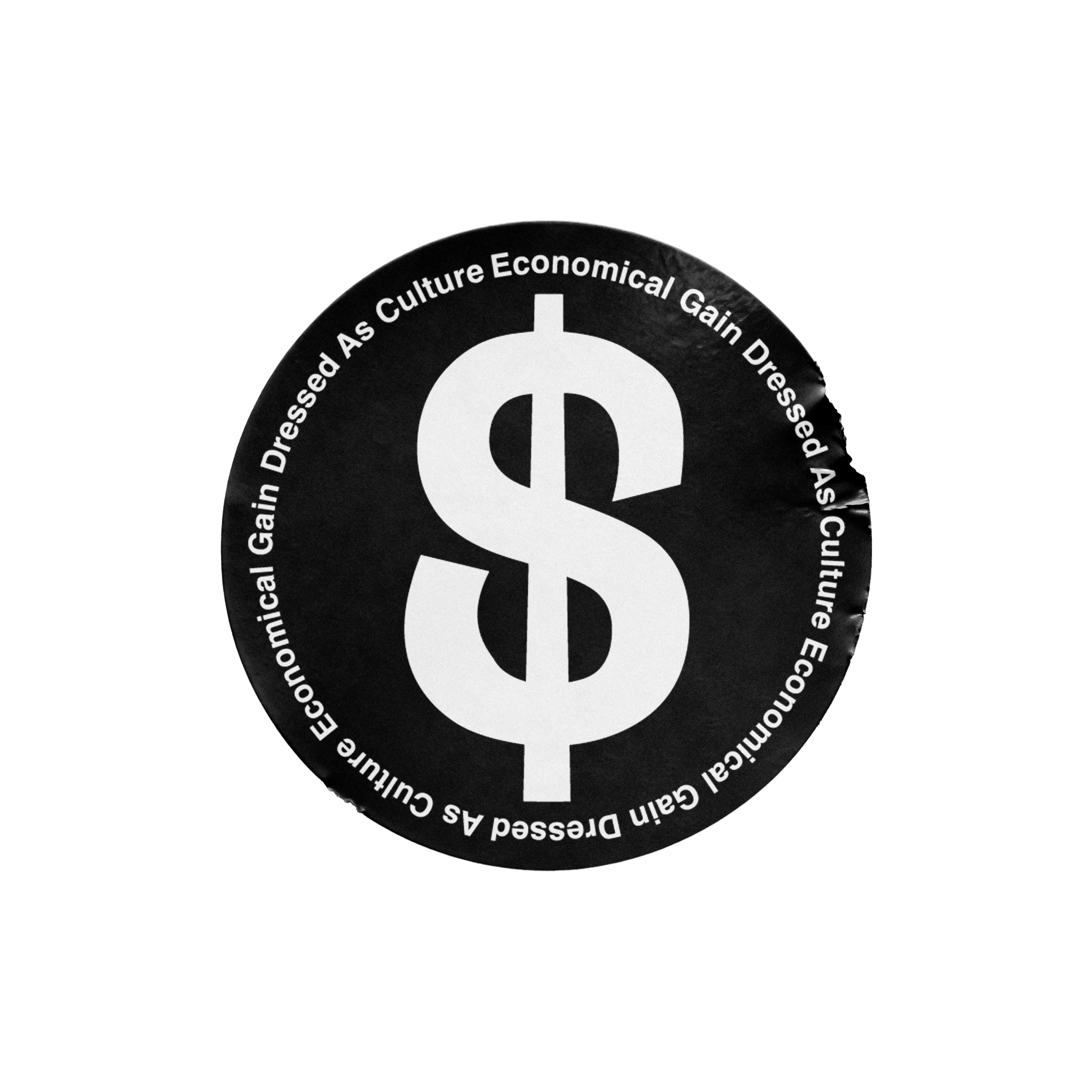
¥AFF$ sticker, white on black

Economical
Gain Dressed
As Culture
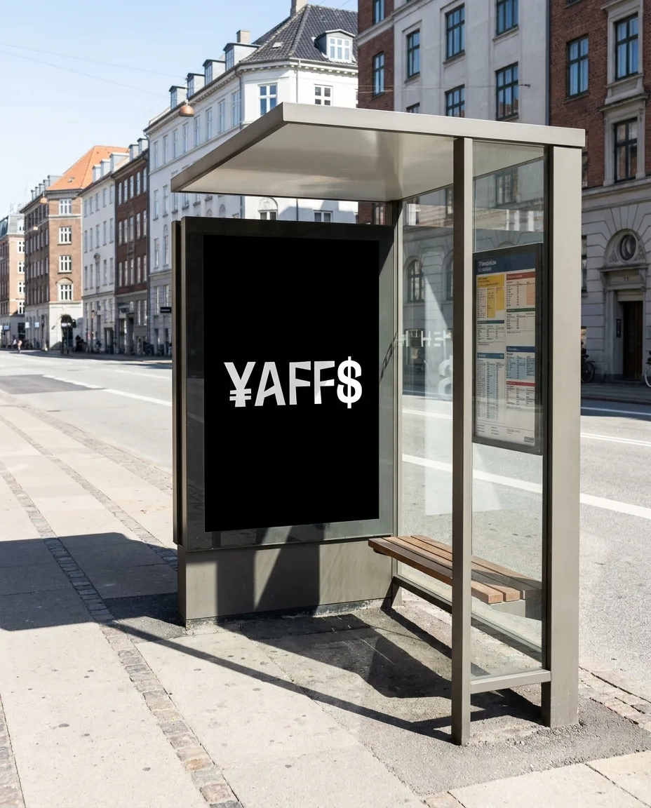
¥AFF$ bus stop OOH mockup
Concept

The logotype uses currency symbols as letters (¥ for Y, $ for S) so the name itself reads as money. The sticker copy, "Economical Gain Dressed As Culture," functions as a brand manifesto printed in a circle around a dollar sign.
02

02 / 03

Solfrugt

Brand Identity

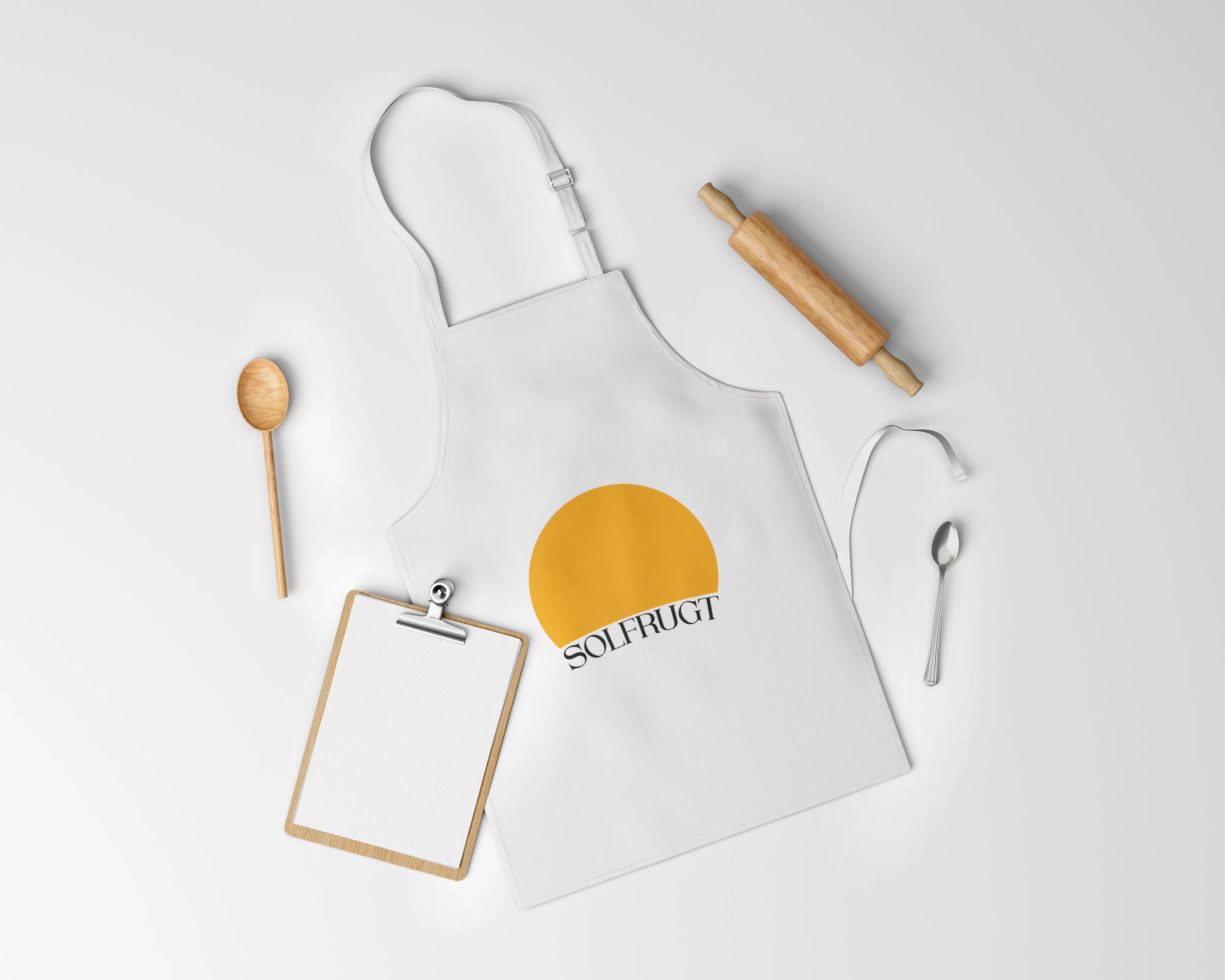
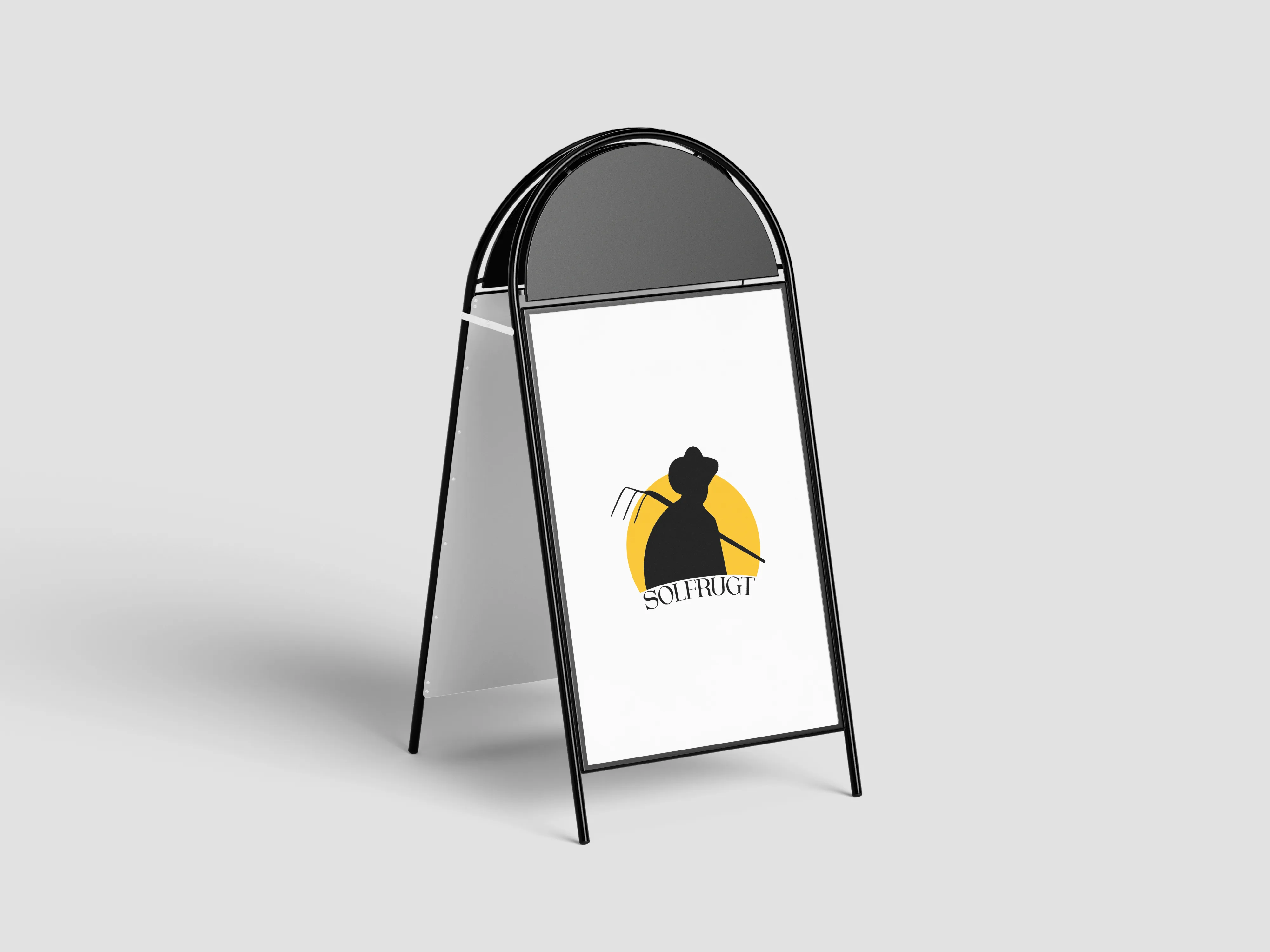
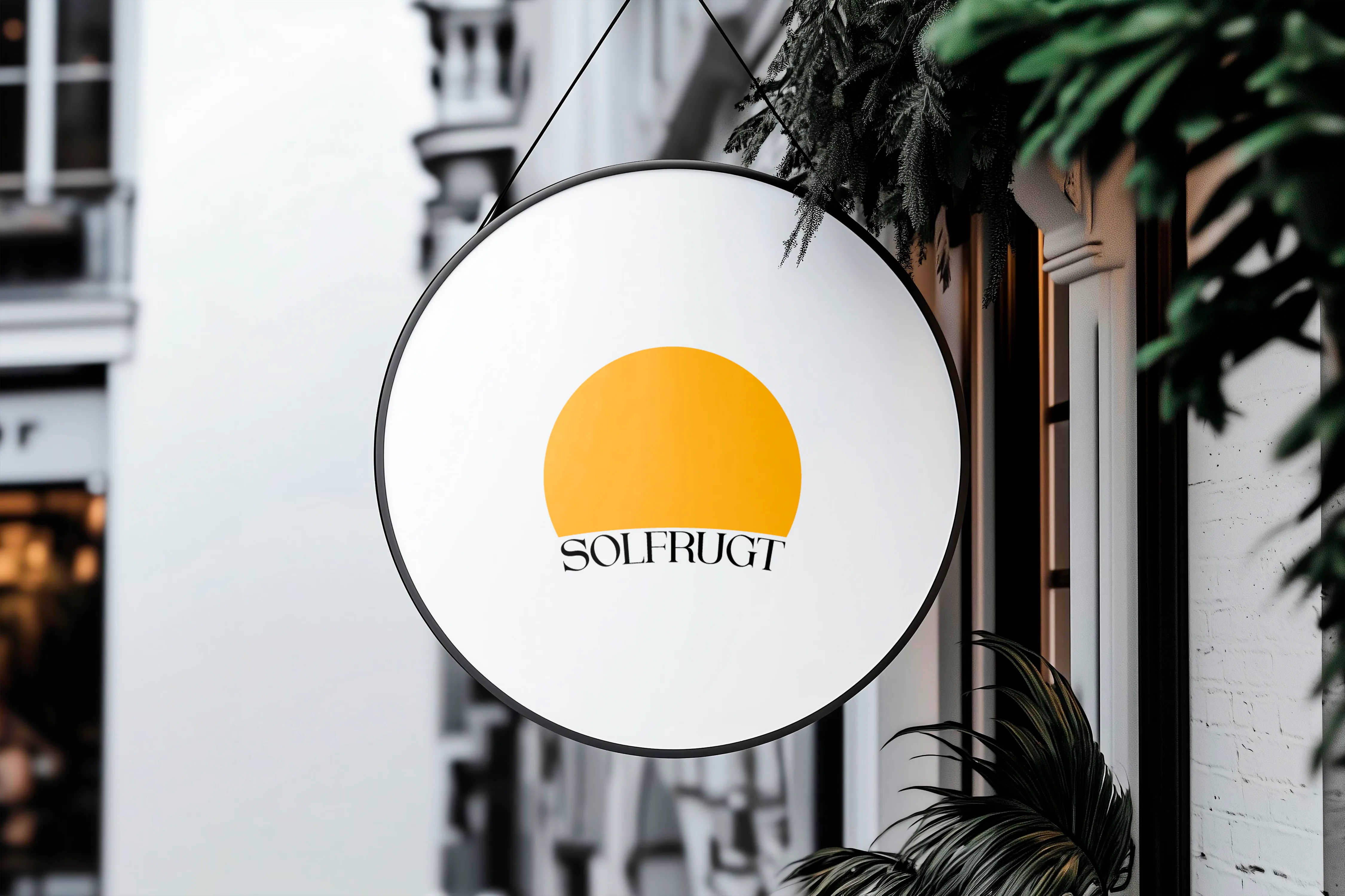
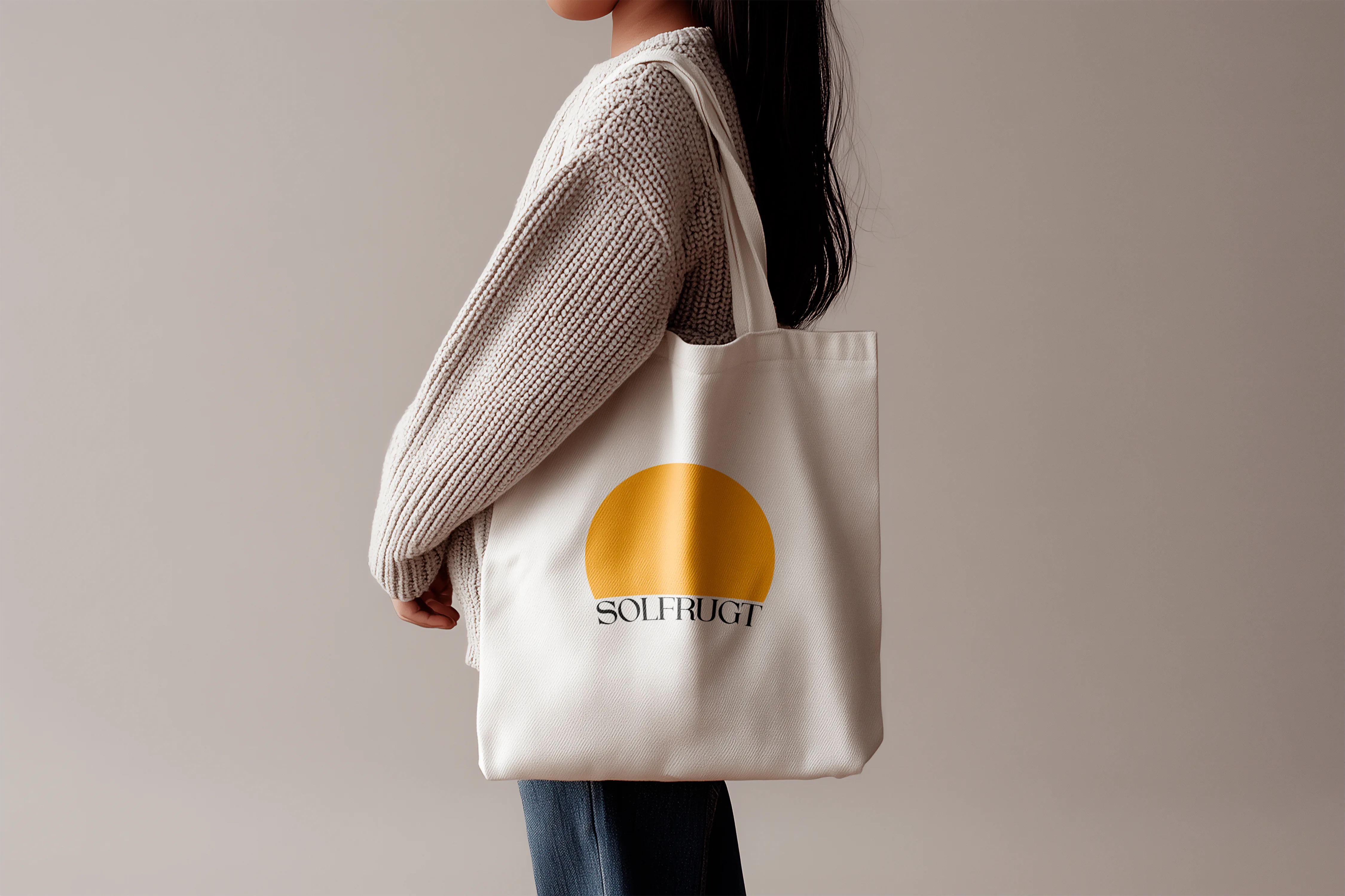
Solfrugt is a fresh produce stall at Torvehallerne in Copenhagen, known for seasonal fruits and vegetables sourced from Danish farms. The identity is built around a sun mark, warm and simple, paired with a serif wordmark that gives the brand a sense of quality without overcomplicating it. Applied across signage, aprons and merchandise.

Brand Identity · Signage · Merchandise
Solfrugt hanging sign Solfrugt tote bag Solfrugt apron Solfrugt A-board
03

03 / 03

Wolt
× Netflix

Ad Campaign Concept

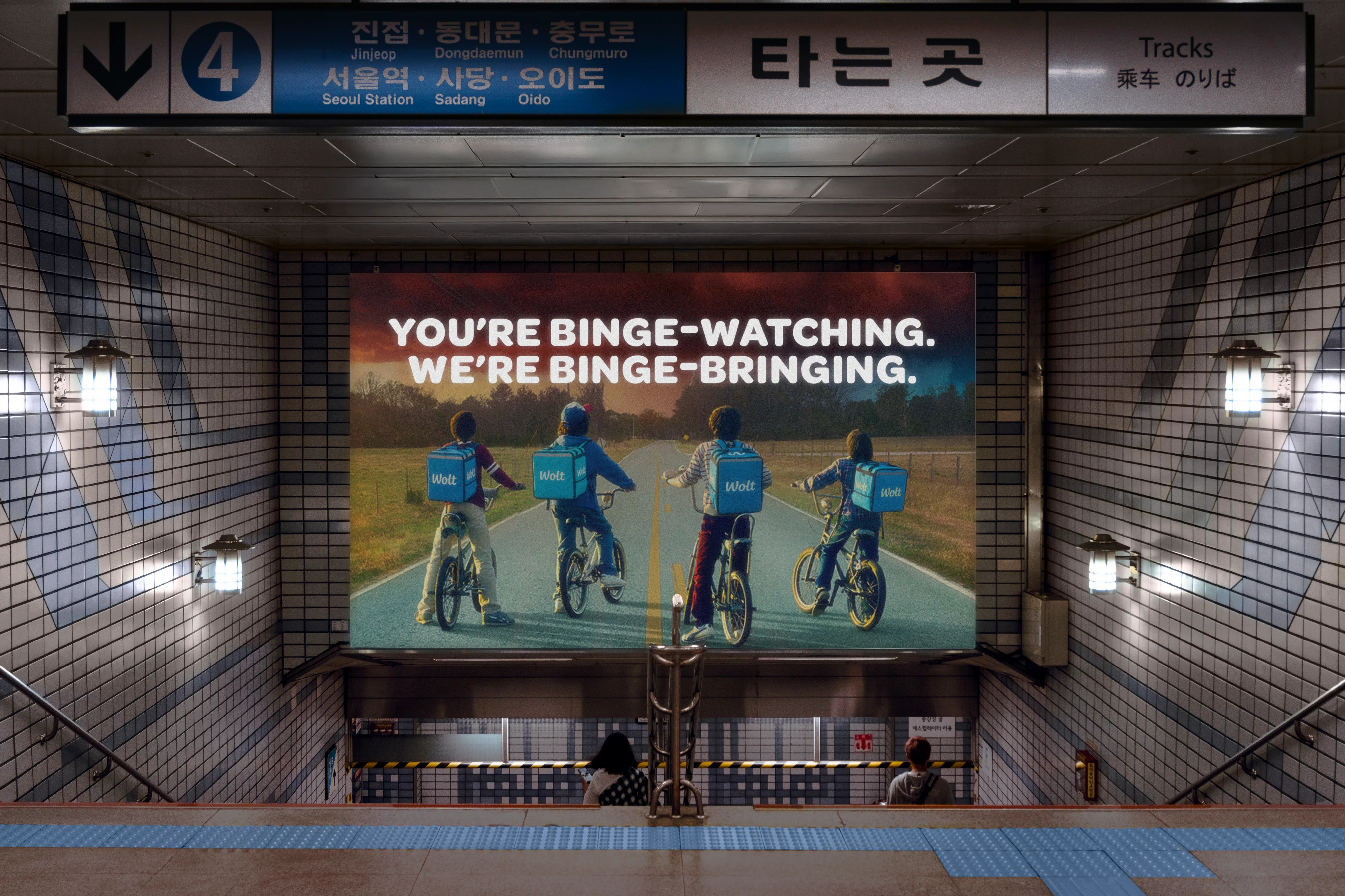
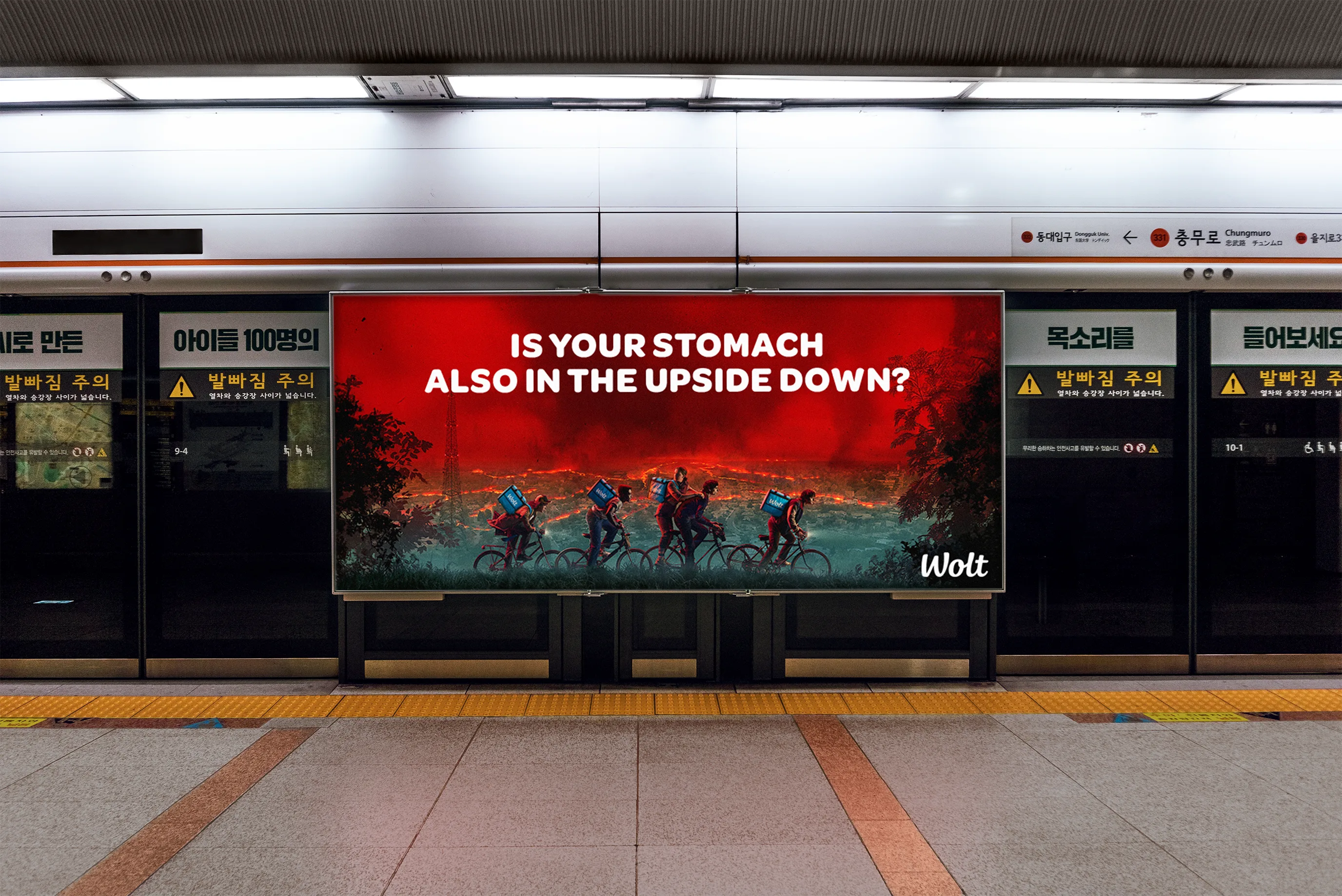
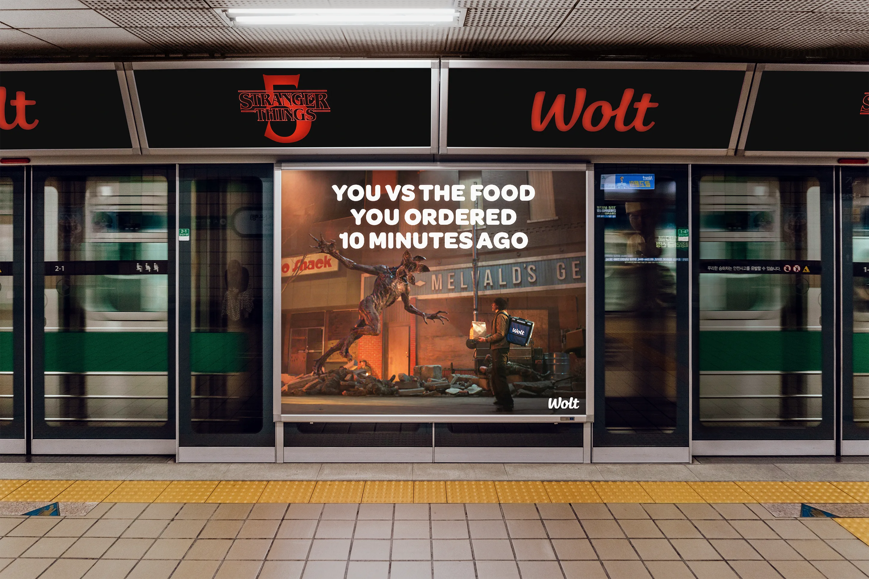
A campaign concept for Wolt timed to the Stranger Things finale in December 2025. Two executions, two angles: one playing on binge-watching behaviour, one pulling the viewer directly into the Upside Down. Both the visuals and copy were developed independently. The campaign was submitted to Wolt, who responded positively and passed it to their marketing team.

Campaign · Copywriting · OOH
Wolt — You're binge-watching. We're binge-bringing. Wolt — Is your stomach also in the Upside Down? Wolt — Is your stomach also in the Upside Down?

Submitted to Wolt in December 2025. Their team responded positively and forwarded the work to their marketing department.

04

04 / 04

Down
2Earth

Event Identity

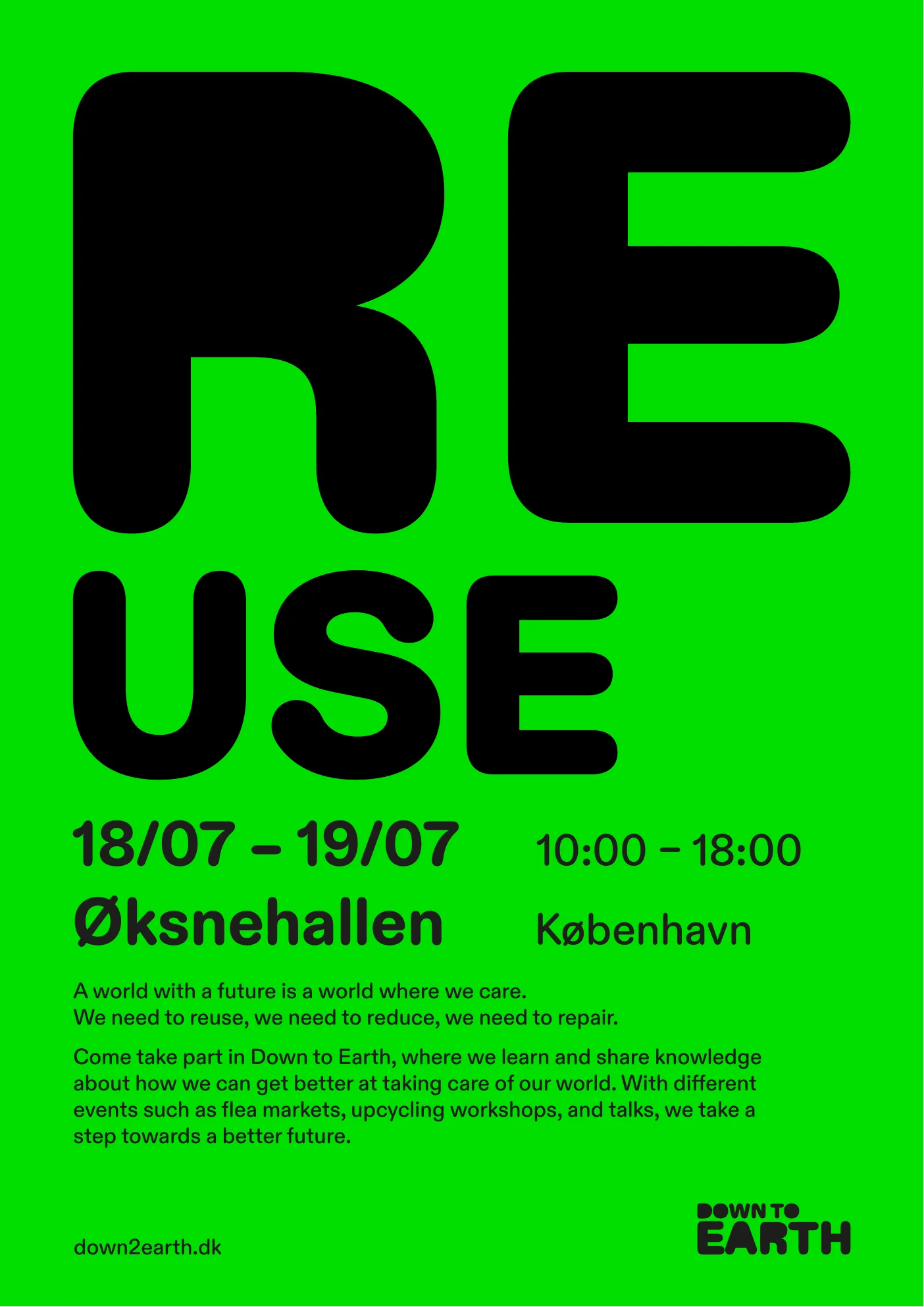
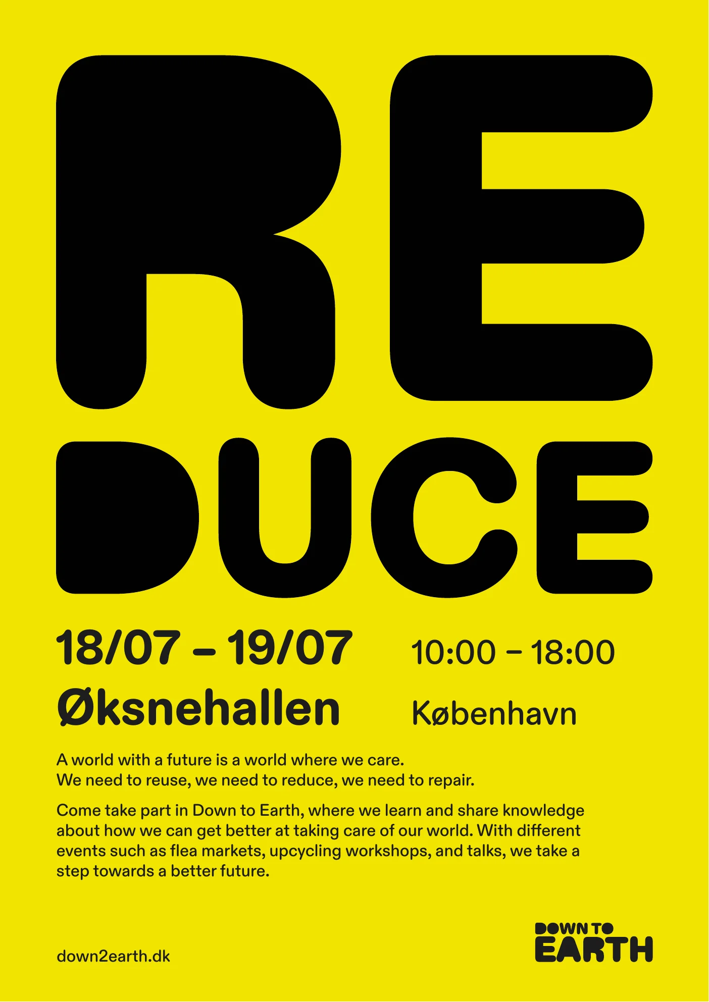
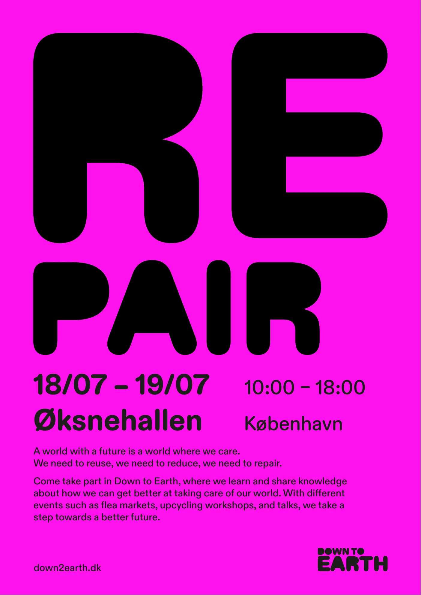
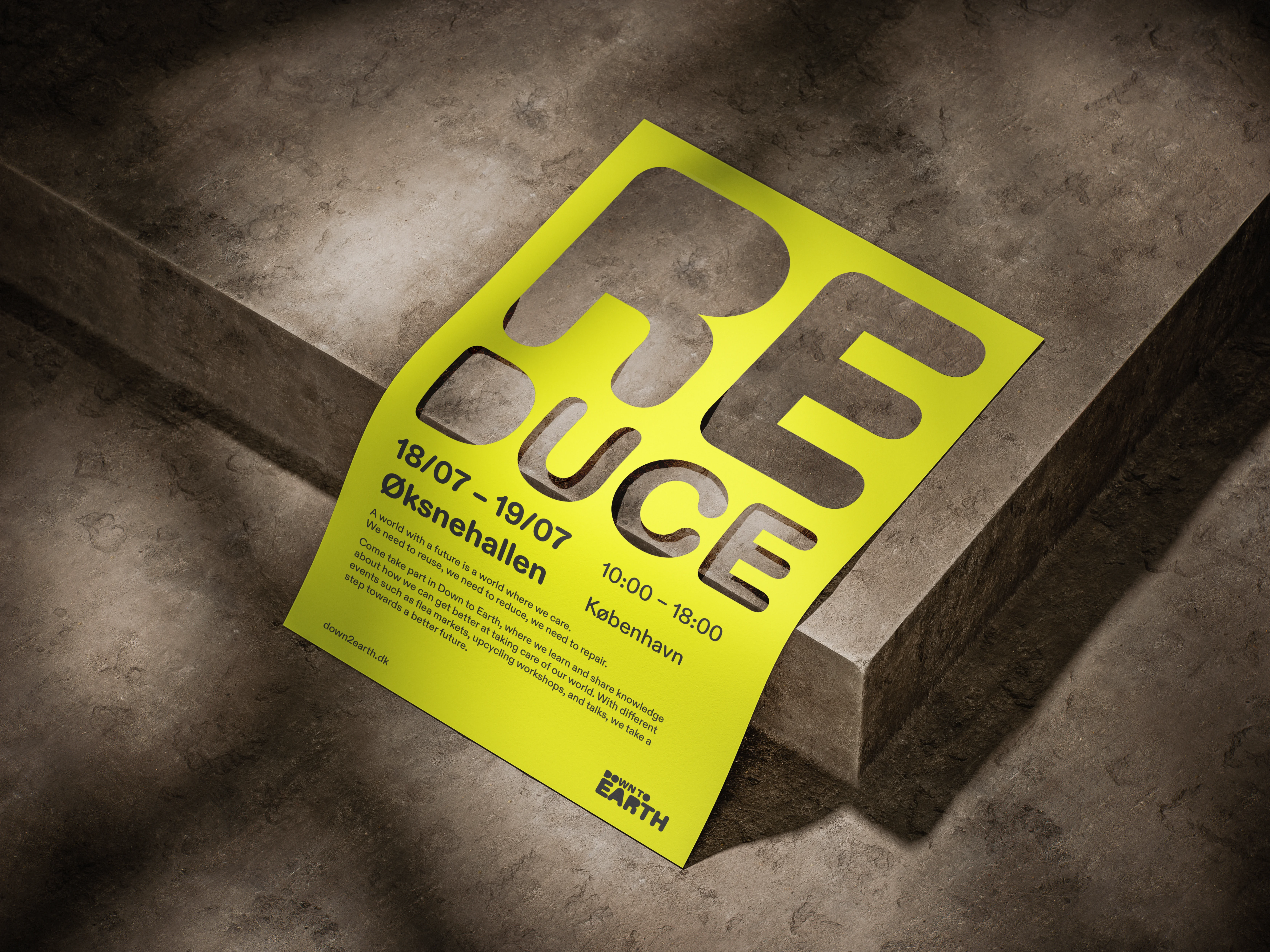
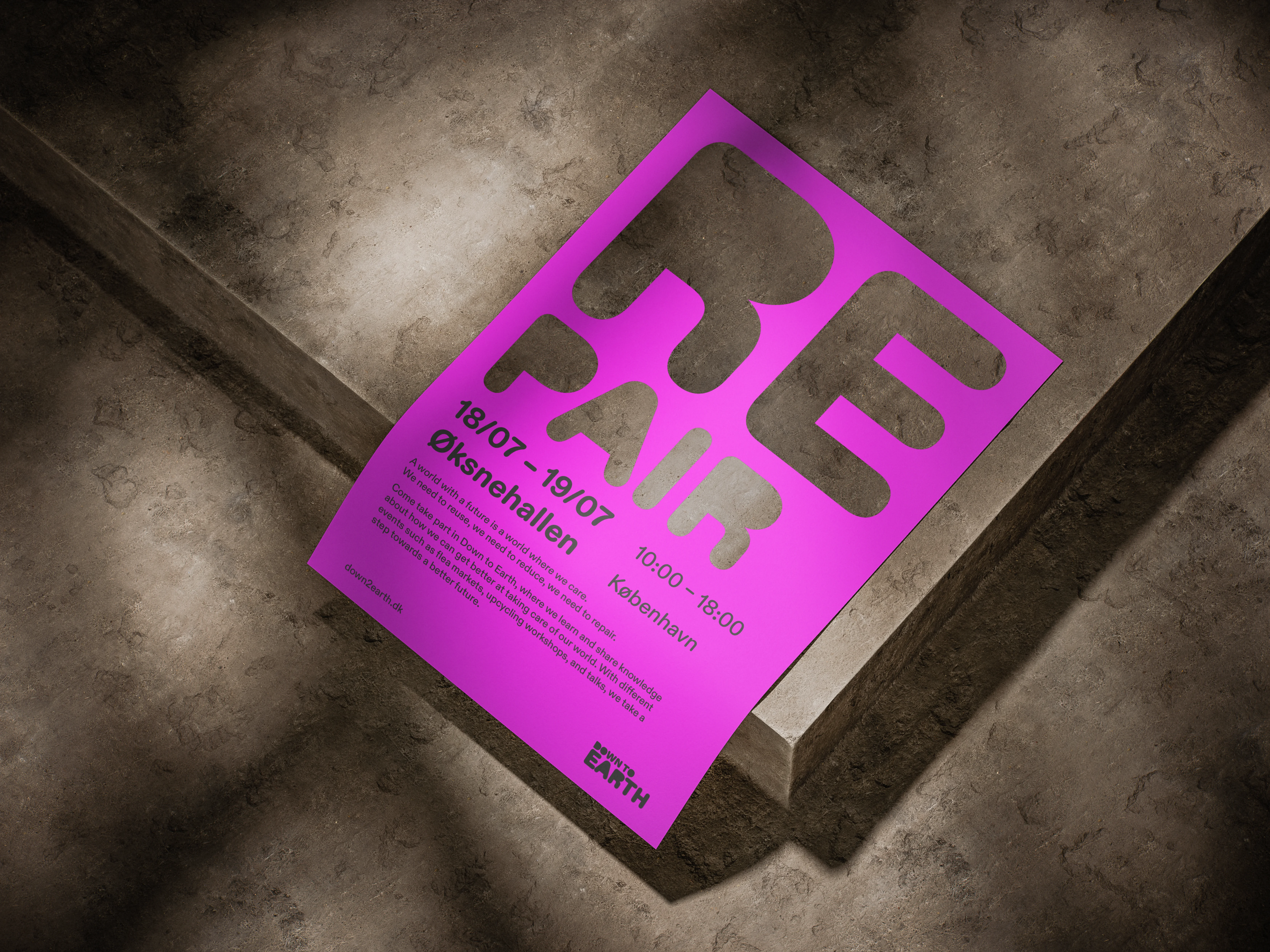
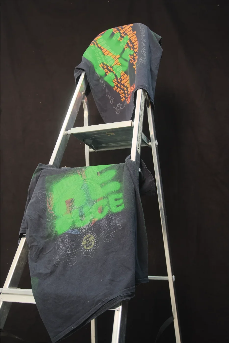
Visual identity for Down to Earth, a Copenhagen sustainability festival at Øksnehallen. The concept is literal: neon posters where the letters are cut out, revealing the concrete wall behind. Reuse, Reduce, Repair, demonstrated through the design rather than stated. Maximum saturation to cut through the cityscape. The t-shirts continue the concept, screenprinted on existing concert tees.

Identity · Print · OOH · Merch
Down2Earth — Reuse poster
Down2Earth — Reduce poster
Down2Earth — Repair poster
Down2Earth — Reduce mockup
Concept

The cut-out effect uses the wall as material. The background becomes the letters. By reusing the existing surface, the design demonstrates its own message: Reuse, Reduce, Repair.

Reuse.
Reduce.
Repair.

Down2Earth — Repair mockup
Down2Earth — T-shirts on ladder

Contact

Get in
touch.

tobiasthorvaldsen@gmail.com

Based in Denmark  ·  Available for internships & freelance work